Showing posts with label kerning. Show all posts

Sunday, April 15, 2018

Bad Kerning Or Nah?

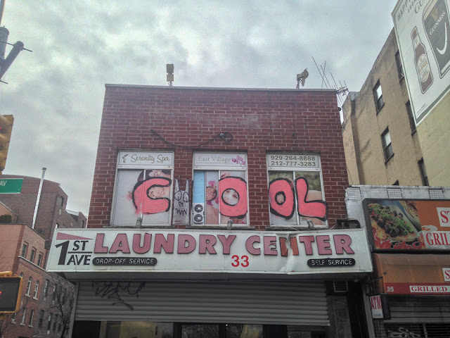
This new doodle by Cool, above the beloved 1st Ave Laundry Center on the corner of First Avenue and East 2nd Street, shows that even graffiti is not immune from the ravages of bad kerning:

Bad kerning.

Unless he considered the two exhaust fans to be Os, in which case: good use of background materials!

#eastvillage #1stavelaundrycenter #2ndstreet #cool #firstavenue #graffiti #kerning

Friday, October 20, 2017

T ell M aM a

Ever since the formerly-beloved Nie's Service Center was closed for prostitution, East Villagers have been searching for a new place to get their, uh, Chinese health and stuff.

The beloved Tell MaMa Chinese Health Salon, on East 6th Street, looks like it might fit the bill!

Tell MaMa.

If it's safe to tell mama, it's gotta be legit!

One thing's for sure: their windows are completely blocked!

Blocked windows.

There's almost more of these places than there are gypsy fortune tellers, these days!

(I am horrified by this kerning — horrified, I say!)

#eastvillage #6thstreet #tellmamachinesehealthsalon #badkerning

Friday, January 6, 2017

Petrus Stuyvesant's Pear Tree

As you probably already know, East Villagers love trees — they're crazy about them! This is nothing new.

I was walking down Third Avenue recently, when I saw this plaque on the wall outside the beloved Kiehl's, dedicated to a tree:

Plaque.

Here is a close-up:

Close-up.

But what's that?!

Poorly placed quotation mark.

What a poorly-placed quotation mark!

There needs to be a Typesetting Society, that fixes other Society's bad plaques!

#eastvillage #kiehls #plaques #signs #thehollandsociety #thirdavenue #kerning

Tuesday, October 4, 2016

Optical vs. Metrics

When setting automatic kerning, sometimes you use Metrics and other times you use Optical. When setting automatic kerning for numbers in Futura, however, you must always use Optical!

Numbers in Futura are particularly wonky, especially the number 1. This is what happened when the creators of the "90210 The Musical" sign, at the beloved Theatre 80 St. Marks, on St. Marks Place, used Metrics:

Bad kerning, especially around the "1".

But that's the least of it! In the notice board is a sign advertising the musical that uses an entirely different font!

Entirely different font.

I like Futura Bold as much as the next East Villager, but I like consistency more!

Also, they should have adjusted the kerning manually on this sign, eh?!

#eastvillage #90210themusical #fonts #kerning #metrics #optical #signs #stmarksplace #theatre80stmarks

Thursday, April 30, 2015

Dead, But Secured

I would have sworn that I posted something once, of a dead tree chained up to something, but I couldn't find it. So I have nothing to link to when presenting this:

Dead tree chained to railing.

A dead tree, chained to a railing, on East 9th Street.

Bad kerning too, on the 425!

#eastvillage #trees #chains #9thstreet #kerning

Friday, March 6, 2015

Bad Kerning

I was looking for a funny pie chart I saw once on the web site xkcd.com (one of my favorites!) to reply on Facebook with, when I saw this, which is very funny and very true:


East Villagers love to recognize bad kerning!

#eastvillage #signs #kerning #xkdc

Tuesday, November 4, 2014

A UM N AMASTE

A um N amaste is a book and crystal gallery opening soon on East 14th Street, here in sunny, downtown East Village.

A UM  N AMASTE

If you want a place to bring balance to your life, look for balance in their sign. You don't want to see gaps between letters, or letters crashing into each other.

Om mmmm…

#eastvillage #14thstreet #aumnamaste #signs #kerning

Friday, October 10, 2014

Just About The Worst Kerning Ever

This is just sad:

Sad.

Cacio e P epe.

Didn't the person setting this up see the space between the "P" and the "e" following it?

I'll bet this is what happened:

The person who set up the job submitted it to the restaurant owner for approval. The owner said "What's this space between the "P" and the "e", and the person doing the job said "That's the way that font is. There's nothing I can do about it."

Look how the lower-case "p" hits the edge too. Tsk, tsk, tsk.

Sunday, October 5, 2014

Die, 101

This sign jumped right out at me. That's just what bad kerning does, it jumps right out at me. What does it say? Die Ci? Die 101*? Is it German?

Renegade C.

In this case, it's not actually kerning, since these letters aren't printed, but it's bad letter placement, yielding the affect of bad kerning.

You can see how the "c" is rotated counter-clockwise from the top a bit, creating a larger space between the "e" and "c" than the "c" and "i".

---

*Roman numerals for 101.

Friday, September 5, 2014

Verameat, One Last Time

I am psyched! Take a look at this photo:


I wrote that this sign had bad kerning, and Vera fixed it!

I'm not psyched because I actually have readers, I'm psyched because someone cares enough about kerning to fix it when it's off! (Typesetting is fast becoming a lost art.)

Let me go one step further to say that this is a good job. Here is a comparison of the two signs:


I like how the letters fill the space now. Plus, they're heavier. And those bolts (or whatever they were to the bottom/left of the V) are now hidden.

(Cue applause.)

Saturday, August 30, 2014

Signs

I don't want to come across as too critical, but there are some signs I've noticed recently that are in need of repair. Here's the first one, from the side of a building on East 3rd Street:


If you look at this, you will notice horizontal lines that were used to keep the size of the letters and the leading (space between lines) consistent. This was commendable. I commend the maker of this sign. However, once the letters are in place, it's customary to remove those horizontal lines. Leaving them makes the sign look unfinished.

Here's another one:


I wouldn't expect the curator of an art gallery to know anything about kerning (the space between letters), but I would expect the person who applied these letters to, and to use his/her better judgement, and not simply place the letters as printed. The kerning on this is terrible.

[UPDATED 9/1]

Ee-gads. The kerning on this one is so bad that I can't tell if it's deliberate or not. Maybe it's Spanglish for "See Meat," or "Look To Meat," or something.